A well-timed redesign can be the turning point for your product—whether you're cleaning up UX friction, improving technical performance, or repositioning in a crowded market. In this post, we’ve collected product redesign examples that show how real teams used the right redesign service to solve serious product challenges and move forward with confidence.
You’ll see SaaS product redesign stories that focus on scale and performance, impressive redesign examples that elevate brand perception, and even an iterative redesign or two where continuous improvements added up to major gains. What ties them together: clear goals, strategic execution, and results that stick.
If you're planning your own upgrade, these successful product redesign examples offer valuable insight into how teams—from startups to enterprises—make smart decisions under pressure.
The power of a product redesign
Redesigning a product—whether internal or customer-facing—can lead to significant improvements in usability, performance, and perception. For external platforms, a modern UI and smoother user flows can drive retention and growth. For internal tools, a redesign often results in better adoption, faster task completion, and reduced reliance on support or training.
The most impressive redesign examples share a common thread: they’re rooted in strategy. These projects go beyond aesthetics to address workflow friction, technical limitations, and evolving user needs. They reflect a clear understanding of what’s no longer working—and a focused plan to build something better.
If you're starting to evaluate those issues within your own product, check out these examples and get a sense of what is possible.
1. MMToolParts.com: Modernizing a long-running ecommerce business
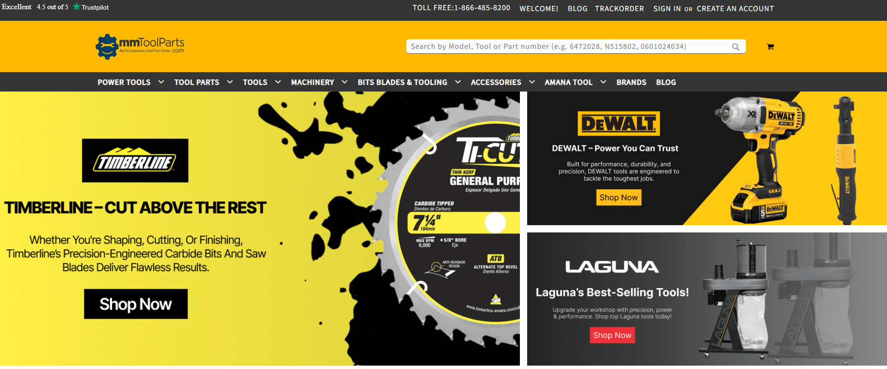
With over 75 years in business and more than 500,000 products in their catalog, MMToolParts.com is a staple in the construction, woodworking, and power tool community. But despite their reputation and traffic, their outdated ecommerce platform was holding them back.
The legacy site struggled with performance, lacked scalability, and made it difficult for the marketing team to analyze visitor behavior or optimize conversions. The complexity of migrating such a large catalog—and preserving search traffic—made this redesign a high-stakes effort.
The product was fully rebuilt on a modern architecture, including seamless migration of all products, diagrams, and customer data. The new design introduced improved navigation, upsell flows, and integrated customer insight tools—resulting in a faster, more efficient site and significantly stronger conversion rates.
Key takeaways from this redesign example:
Redesigned user flows and site architecture to support 500,000+ SKUs
Improved ecommerce experience with built-in upsell strategies
Introduced marketing visibility through business intelligence tools
Achieved higher conversions without sacrificing performance or SEO
Read more about this redesign here.
2. Documoto: Redesigning for clarity, content, and customer self-service
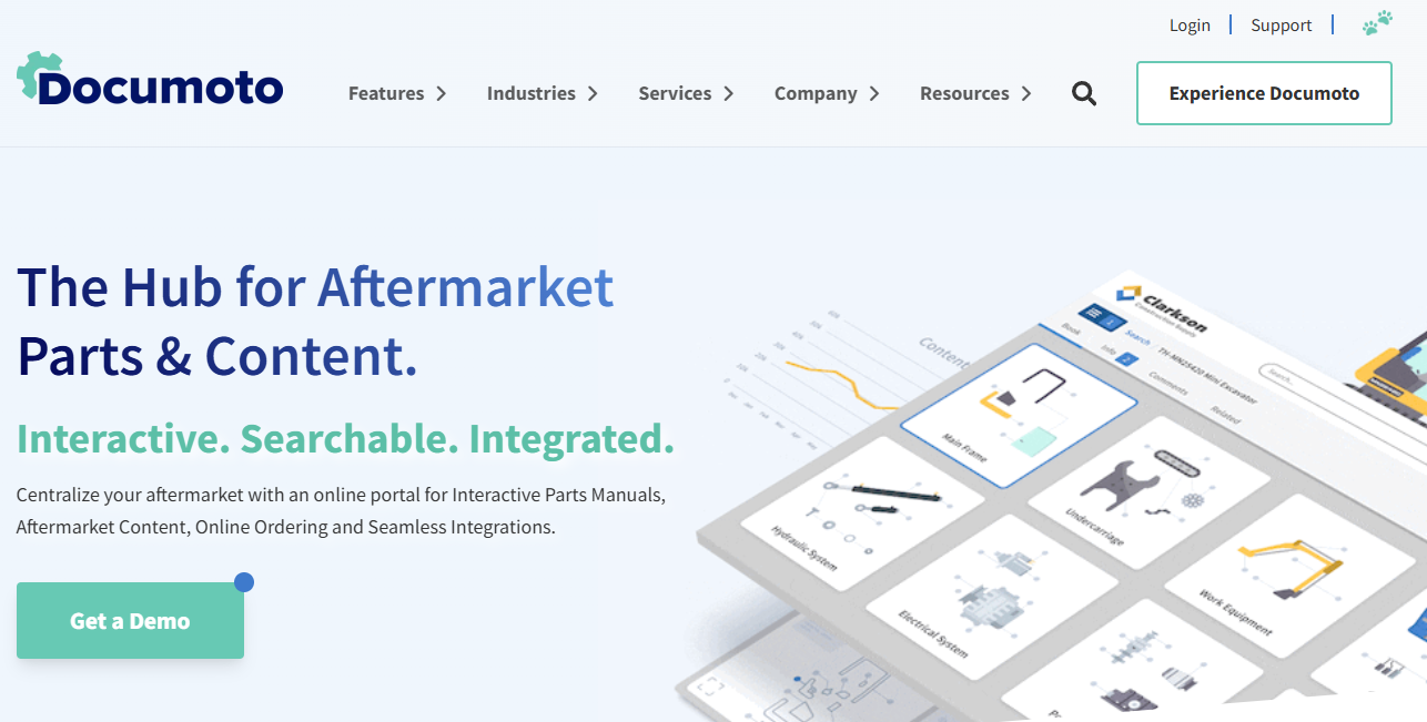
Documoto, a SaaS platform for equipment manufacturers and asset-heavy organizations, launched a full redesign of its corporate website to better reflect its evolving product and service offerings. The redesign was more than visual polish—it was built to serve different user roles, support self-qualification, and simplify access to technical and support content.
The new website organizes information by product features, industry verticals, and user roles, helping site visitors find relevant content quickly. It also integrates support tools like the Documoto Knowledge Base, FAQ library, and Documoto Academy—giving users a unified experience across marketing, education, and support.
This refresh positions Documoto to scale its content strategy while delivering a clearer, more intuitive UX that supports both conversion and long-term customer success.
Key takeaways from this redesign example:
Reorganized content architecture to support role-based navigation
Integrated educational and support resources into the core UX
Streamlined site design to reflect modern SaaS standards and product clarity
Read more about this redesign here.
3. Musician’s Toolkit: A fresh build for a new standard in online music education
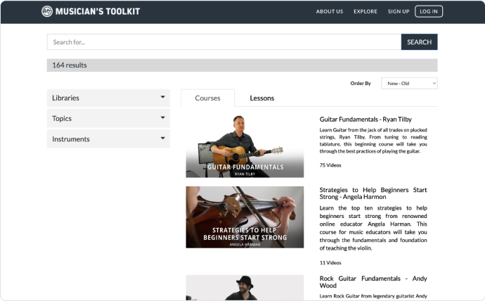
Musician’s Toolkit is a platform designed for students and teachers seeking flexible, high-quality instruction in vocals, strings, and band instruments. With strong market demand and a clear product vision, the company needed a reliable development partner to rebuild their platform and bring it to market—fast.
The existing platform struggled with a fragmented backend, inconsistent user experience, and slow progress on critical features. Rather than continue patching, the team opted for a clean slate: a ground-up rebuild that would support scalability and future innovation.
In just three months, the product was fully redesigned and relaunched with a modern frontend, clean architecture, and seamless integration with third-party learning systems. The new experience helped shift the focus back where it belonged—on learning and growth—not on clunky technology.
Key takeaways from this redesign example:
Rebuilt backend architecture to support modular learning tools
Redesigned UI to simplify lesson access and progress tracking
Achieved full platform relaunch in just 3 months
Enabled go-to-market success and rapid feature expansion
Read more about this redesign here.
4. US Ski & Snowboard Team: Streamlining athlete management and ecommerce
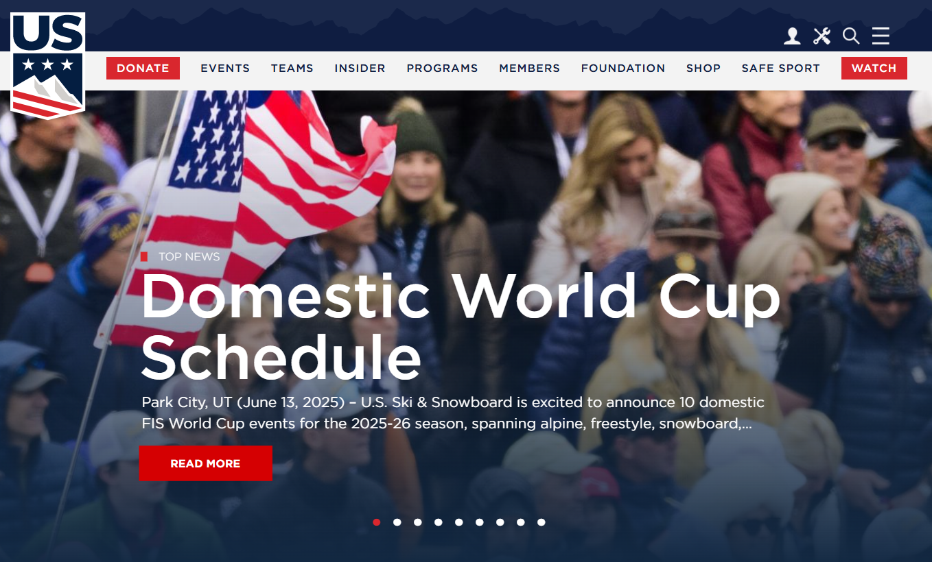
With over 30,000 student-athletes, 450 sports clubs, and a growing national presence, the US Ski & Snowboard Team needed better tools to manage both internal operations and external engagement. Their legacy systems were disjointed, leading to a poor experience for athletes and inefficiencies across departments.
The team also wanted to create a fully branded ecommerce store that integrated with membership and athlete data—a major step toward modernization and revenue diversification.
The redesign focused on unifying fragmented systems, replacing outdated desktop software, and improving the user experience through a streamlined interface and clean architecture. A custom API tied together the membership platform, ecommerce store, and internal tools, giving staff and users a single point of interaction.
Key takeaways from this redesign example:
Unified athlete and membership data through a custom API
Replaced outdated tools with scalable, web-based software
Increased ecommerce revenue through a seamless user experience
Read more about this redesign here.
5. CYBERBIZ: Redesigning an admin dashboard with user-driven validation

CYBERBIZ, a Taiwanese e-commerce platform serving local retailers, set out to redesign its admin dashboard to improve usability and reduce support load. Rather than making assumptions about user behavior, the product team took a data-driven, feedback-first approach to shaping the new experience.
They recruited beta testers through in-app surveys, enabling faster iteration and targeted improvements before the full release. The team also introduced onboarding walkthroughs and feature announcements to reduce confusion during the transition.
By connecting session analytics with direct feedback, CYBERBIZ was able to validate design decisions, identify areas for improvement, and ultimately roll out a redesigned dashboard with fewer support tickets and higher user adoption.
Key takeaways from this redesign example:
Beta testers were recruited directly in-app, speeding up iteration cycles
Onboarding flows and interactive announcements eased the transition to the new dashboard
Unified feedback and usage data helped the team prioritize with confidence
The result: higher adoption, fewer support tickets, and a cleaner admin experience
Read more about this redesign here.
6. CountingWorks PRO: Rebuilding for scale and stability
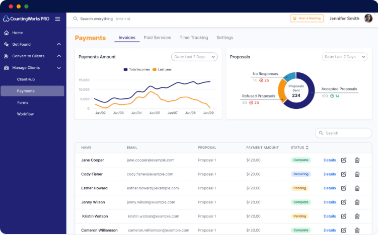
CountingWorks PRO provides marketing and practice management tools for tax professionals—but growth was stalled by infrastructure limitations and a poor user experience. After working with multiple development teams that lacked full-stack capability, the company needed a partner that could rebuild the platform to scale.
Rather than continue patching a brittle system, the team opted for a complete redesign. The new product was rebuilt from the ground up, with a focus on performance, reliability, and UX clarity—giving the company the foundation it needed to expand its user base without adding operational overhead.
Key takeaways from this redesign example:
Rebuilt platform increased scalability by 10x
Improved UX led to fewer support requests
Founder regained time to focus on business growth
Read more about this redesign here.
7. Bruce Clay Inc.: Redesigning for creative impact and market positioning
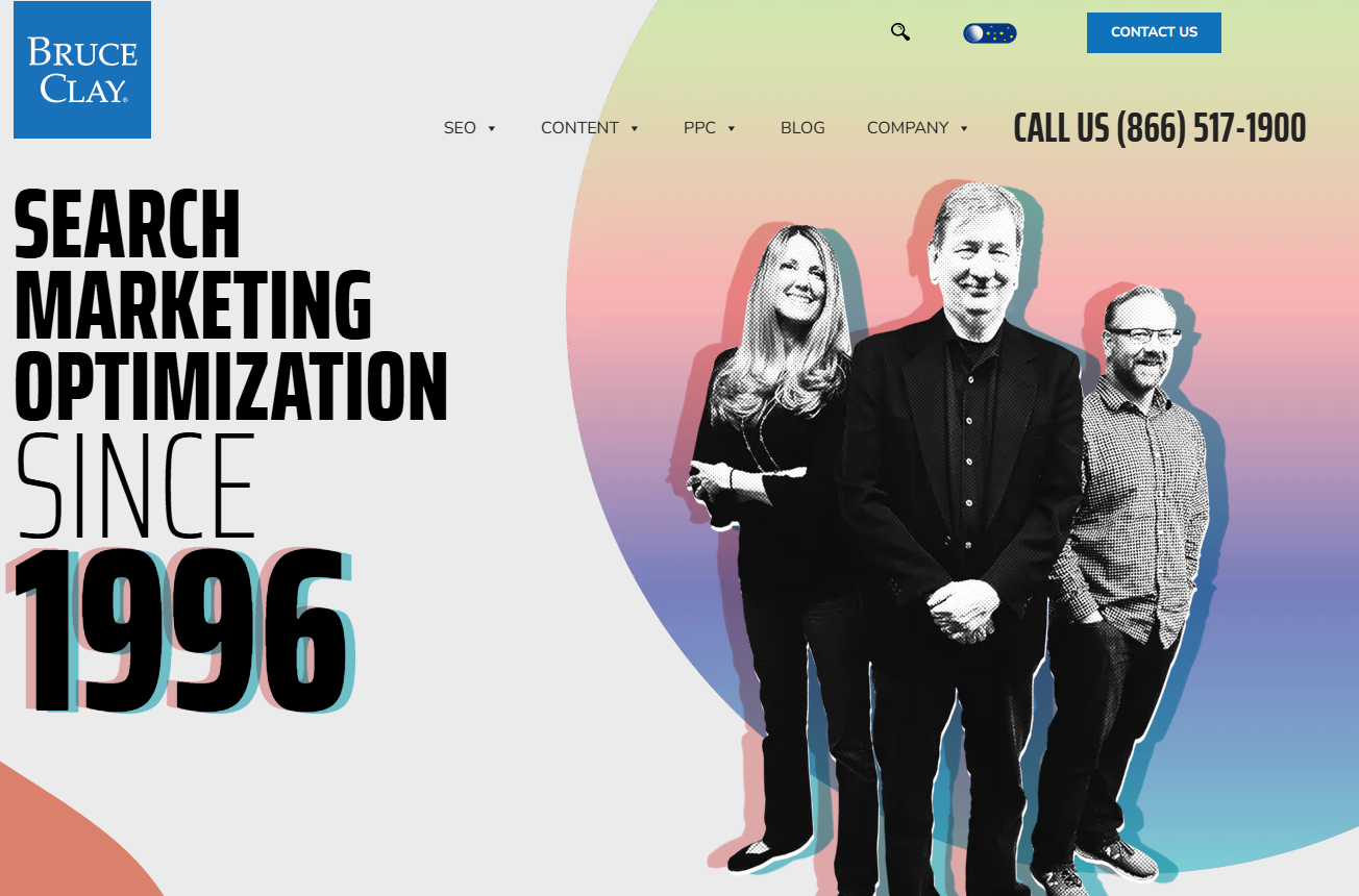
As a long-established leader in the SEO industry, Bruce Clay Inc. redesigned its website to reflect a bolder, more innovative identity. The previous design leaned conservative and minimal—blues, blacks, and static layouts. The new experience introduced oversized visuals, motion, and a dynamic color palette designed to visually communicate their forward-thinking approach.
The redesign wasn’t just cosmetic. It supported the launch of a new SEO plugin for WordPress, providing users with access to competitive keyword analysis and real-time SEO recommendations within their content workflows. The site redesign positioned the brand not just as a trusted agency, but as a creator of powerful SEO tools.
Key takeaways from this redesign example:
Used bold, dynamic visuals to reflect a modern, innovation-led identity
Aligned site design with the launch of proprietary SEO tools
Expanded the site's role to serve both marketing and product engagement
Moved away from traditional agency styling to stand out in a crowded space
Read more about this redesign here.
8. Drivably: Redesigning for clarity, speed, and market fit
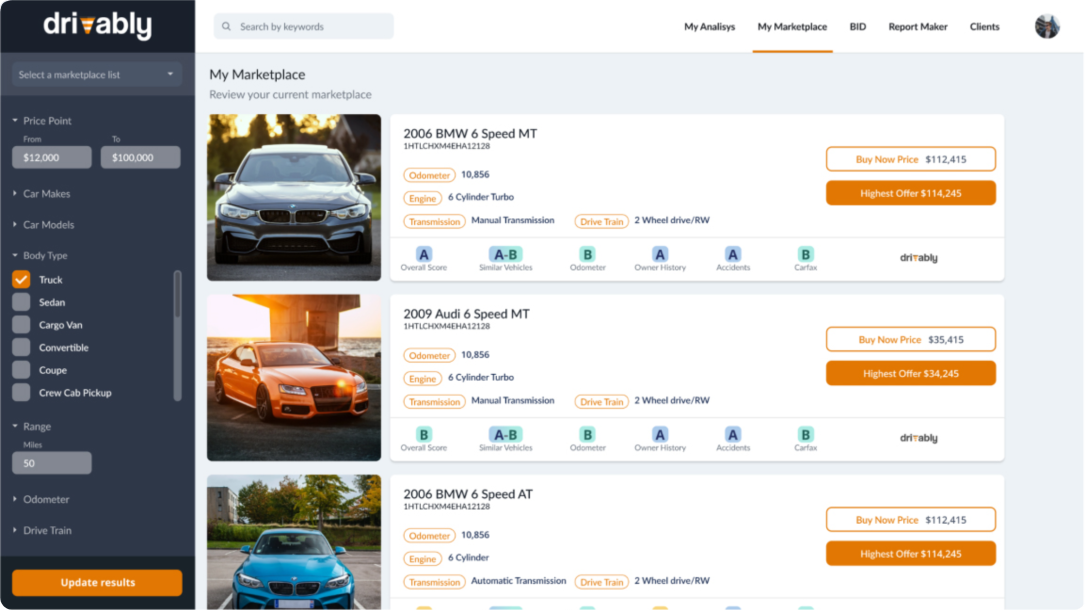
Drivably helps used car dealers make smarter, faster inventory decisions—but the company’s initial product had grown too complex, too slow, and too fragile to launch. After months of effort, internal development had delivered a bloated MVP that still wasn't ready for market.
Drivably made the decision to redesign the product from the ground up. By refocusing the UX and architecture around core business needs, they were able to simplify the feature set, improve reliability, and cut development timelines dramatically.
In just 45 days, Drivably launched a new, cleaner, and more focused version of their product—equipped with the tools dealers actually needed and ready to support early growth.
Key takeaways from this redesign example:
Full product redesign led to market launch in just 45 days
Replaced overbuilt MVP with focused, user-first architecture
Enabled early revenue with a lean, reliable SaaS foundation
Read more about this redesign here.
9. Swell: Redesigning a small business CX platform for launch and growth
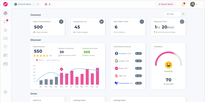
Swell provides local businesses with the tools they need to deliver a modern customer experience—reviews, webchat, surveys, SEO, and more. But after two failed attempts to launch with previous development teams, the product still wasn’t reliable, intuitive, or usable. Time and capital were running out.
Rather than continue patching, Swell opted for a full redesign. Starting with a design sprint, the new team narrowed the focus to a strategic set of features for version one, then rebuilt the platform from scratch. The goal: launch quickly with a clean, scalable foundation built to support rapid iteration.
The result is an inspiring product redesign that helped Swell go to market fast and reach profitability without sacrificing UX or scalability.
Key takeaways from this redesign example:
Full product redesign led to go-to-market in 3 months
Clearer UX and tighter architecture supported rapid growth
Redesign created the foundation for cross-platform expansion
Read more about this redesign here.
10. Walmart: Evolving a legacy brand through strategic redesign
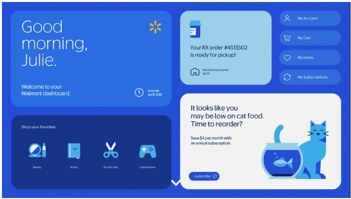
As Walmart continues expanding its digital-first services and omnichannel capabilities, the company introduced a major redesign of its brand identity—blending its historical roots with a more modern, digital-friendly experience. This redesign wasn't just a facelift; it was a strategic move to reflect Walmart’s role as a people-led, tech-powered retailer serving more than 255 million customers weekly.
The refreshed experience includes an updated wordmark, a refined color palette, and a more consistent visual and tonal identity across physical and digital touchpoints. True Blue and Spark Yellow reinforce Walmart’s legacy, while the custom font and simplified design reflect its ambition to be a relatable and digitally fluent brand. The redesign also included in-store updates, a new mobile and web interface, and refreshed marketing assets—all rolled out in phases starting with select store pilots in late 2024.
Key takeaways from this redesign example:
Reinvented brand identity to align with modern digital expectations
Balanced legacy brand elements with a fresh, scalable design system
Rolled out incrementally across web, mobile, and in-store channels
Read more about this redesign here.
11. Inovalon: Redesigning a healthcare platform for speed, scale, and intelligence
Inovalon undertook a three-year transformation to evolve from a hybrid healthcare services company into a pure-play SaaS and DaaS platform. This redesign effort was comprehensive—from backend architecture and product interfaces to the user experience and go-to-market model.
The company transitioned entirely to commercial cloud infrastructure, sunset enterprise data centers, and redesigned all products to operate within a unified cloud platform. They also launched an integrated application portal that spans their entire offering—streamlining the user experience and giving customers real-time access to data and tools powered by AI.
This platform redesign not only modernized Inovalon's product suite but unlocked faster innovation cycles, tighter integration across products, and a scalable foundation for future growth.
Key takeaways from this redesign example:
Redesigned all products around a unified, cloud-native architecture
Replaced legacy systems with a real-time, AI-powered application portal
Enabled faster product delivery and improved scalability across 50,000+ customers
Supported compounding growth in both user engagement and financial performance
Read more about this redesign here.

Dayana Mayfield is a SaaS copywriter and content marketer specializing in SaaS marketing, positioning, and go-to-market strategy. She has consulted for over 195 SaaS companies, focusing on both traffic and conversions. She has been featured in Entrepreneur, Forbes, and Business Insider. Outside of work, Dayana writes SciFi novels and spends her evenings surviving auditions, rehearsals, and tech week as a proud theater mom.