10,500 websites are created every hour.
A website’s credibility is typically judged based on a gut-level visual impression and the overall aesthetics.
When you land on a website, the visitor should be able to easily figure out the information they need without getting confused or frustrated. That's a good user experience with an intuitive user interface.
However, the reality is that most websites don’t give the user a good experience. The buttons are misplaced. The text overlaps large images making it hard for the reader to read. Branding overflows the design and the text is illegible – which makes it hard for the reader to understand and connect with the message.
A strong user interface layout helps organize buttons, menus, text fields, images, forms, and other interactive elements in a way that improves usability and visual hierarchy across websites, SaaS products, mobile apps, and software platforms. Good UI layouts reduce friction, guide users toward the right actions, and make interfaces easier to navigate across devices and screen sizes.
As UI layout design continues to evolve, modern interfaces are becoming more responsive, accessible, and tailored to specific workflows. From dashboards and onboarding flows to ecommerce experiences and internal software tools, the right layout directly impacts the overall UX and how users interact with a product.
User interface design is an ever-evolving domain. And as tech and design trends progress, new layout types keep emerging to engage and meet the expectations of the evolving user.
UI layout names list
Here are 30 user interface layout types for dynamic design:
Grid layout
Stacked layout
Tabbed layout
Card-based layout
Floating action button layout
Split-screen layout
Liquid layout or responsive layout
Magazine layout
Masonry layout
Overlay layout
Circular layout
Canvas layout
Multi-panel layout
Hierarchical layout
Scattered or freeform layout
Infinite scroll layout
Ribbon layout
Timeline layout
Parallax layout
Fixed sidebar layout
Sticky header/footer layout
Off-canvas layout
Cover flow layout
Stepped layout/nested layout
Catalog layout
Empty state layout
Map-based layout
Comparison layout
Form-based layout
Chat-based layout

How to choose the right UI layout
The best UI layouts don’t just look visually appealing. They help users navigate interfaces faster, complete tasks more efficiently, and understand what to do next without confusion. The right UI layout design depends on the goals of the user, the complexity of the workflow, and the type of product you’re building.
1. Identify the user’s primary goal
Start by determining what users need to accomplish within the interface.
Browsing large amounts of content → Grid or card-based layouts
Completing forms or onboarding tasks → Stacked or single-column layouts
Comparing information side-by-side → Split-screen layouts
Monitoring analytics or workflows → Dashboard layouts
The layout should support the user’s primary action instead of competing with it.
2. Consider information density
Some interfaces need to display large amounts of information at once, while others benefit from simplicity.
Data-heavy SaaS products often require grids, sidebars, and modular cards
Simpler products typically perform better with minimal layouts and focused navigation
Too much content in one area increases cognitive load and makes interfaces harder to use.
3. Think about responsiveness across devices
Modern UI layouts should adapt seamlessly across desktop, tablet, and mobile experiences.
Mobile-first products usually benefit from stacked layouts and larger touch targets
Desktop software may require multi-column or split-screen layouts for productivity workflows
Responsive UI layouts improve usability and maintain consistency across devices.
4. Use visual hierarchy to guide attention
Strong visual hierarchy helps users quickly identify the most important information on the page.
To improve hierarchy:
Group related actions together
Maintain consistent spacing
Use typography intentionally
Avoid overcrowding the interface
Clear hierarchy reduces friction and improves overall usability.
5. Prioritize accessibility
Accessible interfaces create better user experiences for everyone.
Good UI layouts should include:
Readable font sizes
Strong color contrast
Predictable navigation patterns
Clear labels and interactive states
Familiar interface patterns also reduce learning curves and help users navigate products more confidently.
6. Match the layout to the workflow
Different workflows require different interface structures.
For example:
Onboarding flows → Wizard or progressive layouts
Analytics dashboards → Grid and card layouts
Collaboration tools → Split-screen layouts
Internal business software → Sidebar and dashboard layouts
The best interface layouts feel natural because they support the way users already think and work.
“A UI layout should reduce decisions, not create them.” — Thainê Ethur, Product Designer at DevSquad
1. Grid layout
Most ecommerce sites use the grid layout on their websites. Organizing UI elements within rows and columns to display multiple items of the same size on a page is called a grid layout. A grid layout structure is chosen to give consistency and visual harmony to the page with a large amount of data.

An example of grid layouts
Grid layouts are also commonly used in SaaS dashboards, analytics software, and operational platforms because they make large amounts of information easier to scan and compare. For example, DevSquad used structured dashboard interfaces while rebuilding CountingWorks PRO, an accounting and practice management platform designed to help users monitor workflows, client data, and operational tasks efficiently.
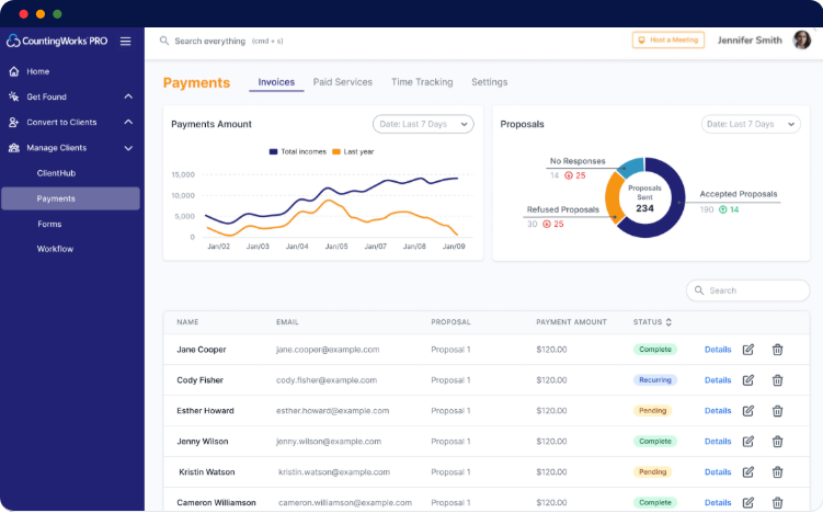
Responsive grid behavior is also important in modern UI layout design. On larger screens, grids can display multiple columns of information simultaneously, while mobile interfaces often resize or stack grid elements to maintain usability across devices.
2. Stacked layout
Stacked layouts, also known as vertical or linear layouts, arrange elements vertically or horizontally. This layout is commonly used for displaying lists or content that needs to be presented in a sequence, such as a chat conversation or a news feed.
Each element occupies the full width or height of the screen, and new elements are added below or beside the existing ones. Stacked layouts are commonly used in lists, feeds, and step-by-step processes.
Stacked UI layouts are especially effective for mobile-first experiences because they create a natural scrolling pattern that is easy for users to follow on smaller screens. Messaging apps, onboarding flows, and mobile dashboards often rely on stacked layouts to simplify navigation and reduce cognitive load.
Single-column stacked layouts are also commonly used in form design because they improve readability and make forms easier to complete. Presenting fields in a clear top-to-bottom sequence helps users move through tasks more efficiently without missing important information.
Because stacked layouts guide users through content step-by-step, they work particularly well for onboarding experiences, chat interfaces, activity feeds, and task-based workflows.

An example showing a stacked UI layout
3. Tabbed layout
Tabbed layout divides the screen into multiple tabs where each tab represents a different section or category of content. Users can switch between tabs to access different sets of information or functionality. Tabbed layouts are often used when there is a need to present a large amount of classified content in a compact space.
Tabbed layouts are commonly used in SaaS dashboards and settings pages because they help organize complex interfaces without overcrowding a single screen. However, too many tabs can make navigation difficult, especially on mobile devices.

Snapshot of an e-commerce website with tabbed UI layouts
4. Card-based layout
Card-based layouts use individual cards or tiles to display discrete units of content or functional services. Each card contains an image, a title, and additional information or actions. Card-based layouts are popular in social media feeds, e-commerce product listings, and content aggregator sites such as Google News or Apple News. This layout is used in sites where a visually appealing modular representation is required.
Card-based UI layouts are also widely used in SaaS dashboards, CRM platforms, and analytics tools because they make information easier to scan and organize into modular sections. In the Swell platform, we established card-based dashboard widgets to help users quickly monitor conversations, reviews, response times, and customer feedback without overcrowding the interface.
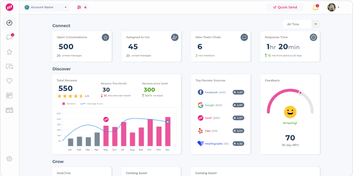
“Good UI layout design is really information prioritization.” — Thainê Ethur, Product Designer at DevSquad
5. Floating action button layout
This type of layout comes with a distinguished button that represents the most frequently used action in a website/application. The button is positioned at a fixed location on the screen and is used to trigger key interactions between the system and the user. Other UI elements are placed around the floating button, creating a visually centered layout.
Floating action button (FAB) layouts are commonly used in mobile-first interfaces because they keep important actions within the user’s thumb zone for faster interaction. However, FABs should be used carefully in enterprise software or data-heavy interfaces where too many floating actions can distract from primary workflows.

An example showing floating action buttons layout
6. Split screen layout
Split screen or split-view layouts divide the interface into two or more sections, horizontally or vertically to allow users to view and interact with two sets of information on multiple screen components simultaneously.
Split-screen layouts are commonly used in collaboration tools, workflow management systems, and editing interfaces where users need to compare information or manage multiple tasks at once. This UI layout is also useful for editing and preview experiences, such as content management systems or design tools, where users need to view changes in real time.

A snapshot showing a split-screen layout
7. Liquid layout or responsive layout
Also known as fluid layout, a liquid layout adapts to the interactivity of the UI elements based on the device, screen size, or resolution.
This layout ensures that the interface uses the screen space effectively, regardless of the device or screen size. Liquid layouts are commonly used in responsive web design. Responsive layouts are designed to provide an optimal user experience across various devices, screen sizes, or resolutions. They also provide a more tailored experience for the users.
Modern responsive UI layouts often use adaptive breakpoints to adjust navigation, spacing, and content structure across desktop, tablet, and mobile experiences. Responsive design also improves accessibility by maintaining readability and usability across different screen sizes and devices.
Responsive UI layout design requires thoughtful planning and testing across devices, but it helps create more consistent and user-friendly experiences for modern web and SaaS applications.

Elementor.com has the option to build a web page with a fluid layout that suits various digital devices such as mobile, tablet, or a PC.UI
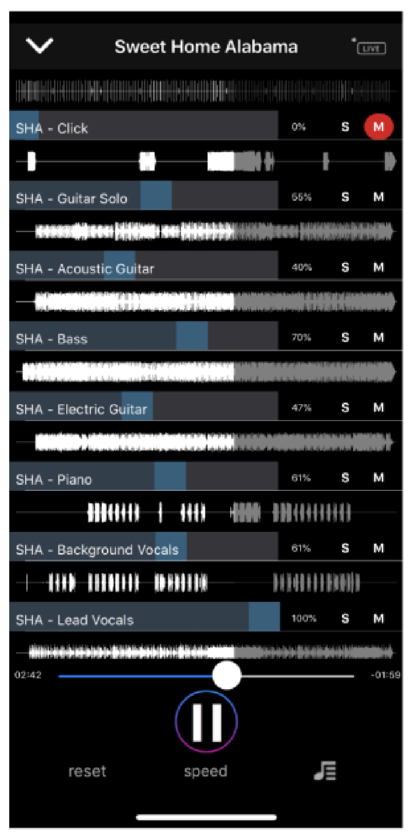
8. Full-screen layout
Full-screen layouts use the entire screen space to display content or functional services. The purpose here is to get rid of distractions and bring the user's attention to the intended call to action or message. Full-screen layouts are commonly used in multimedia presentations, immersive experiences, storytelling websites, portfolios, landing pages, and specific mobile applications. Each section often covers the entire viewport, offering a seamless and immersive browsing experience.
An example of this full-screen layout is the Easy Tracks app. Here we focused on a full-screen layout so that the main functionality of the app was not overcrowded. The app acts as karaoke for the instrument the user is playing and we did not want to distract from the fundamental purpose.
9. Masonry layout
Masonry layouts position interactive elements in asymmetric columns or rows. It’s a grid-like structure, but unlike traditional grid layouts, the elements have varying heights or widths.
This layout style allows for more flexibility in accommodating content of different sizes, such as images or text blocks. Masonry layouts are often used in portfolio websites or image galleries.
However, masonry layouts can become difficult to scan when too much text-heavy content is displayed at once. They typically work best for visual experiences, such as media galleries or portfolios, rather than content-heavy interfaces that require structured reading or comparison.

An example of a masonry layout
10. Overlay layout
Some pages display additional content or interactive elements overlapping on top of the existing interface to display notifications, modal dialogs, pop-up windows, etc. Overlay layouts are designed to keep the main interface fully functional while the user accesses the notifications or pop-ups.
Overlay layouts are commonly used for onboarding prompts, confirmations, inline forms, and quick workflows that should not require users to leave the current screen. You must be careful though. Excessive pop-ups or modal dialogs can create modal fatigue and negatively impact usability, especially on mobile devices or accessibility-focused interfaces.

A pop-up overlaying on a web page is a classic example of an overlay UI layout
11. Circular layout
When you’re shopping for a SaaS product, you usually see a section where the product seamlessly integrates with external apps. This representation is generally done in a circular layout fashion where the elements are positioned along a circular path or in a radial arrangement.
This layout type is visually distinctive and can be useful for representing hierarchical or non-hierarchical relationships. Circular layouts are often seen in data visualizations, menu systems, and control interfaces.

An example of a circular UI layout
12. Canvas layout
Canvas layouts offer a blank canvas or an open workspace where users can use the tools to create freely. This layout type is commonly used in whiteboard tools like Miro, graphic design tools like Canva, and drawing applications like Paint, etc are good examples of a canvas layout.
13. Multi-panel layout
Multi-panel layouts divide the interface into multiple panels or panes, each displaying different sets of content or functionality. Users can interact with and switch between panels to navigate the content and access the discrete functions specific to each panel.
Multi-panel layouts are often used in complex applications like IDEs (Integrated Development Environments) or dashboard systems to present summarized information, statistics, or analytics in a visually appealing and concise form. Dashboard layouts are frequently used in data visualization, business intelligence tools, and admin panels.
These layouts are especially useful in SaaS platforms where users need to monitor multiple workflows or datasets simultaneously.
14. Hierarchical layout
Hierarchical layouts organize UI elements in a hierarchical or tree-like fashion to represent the relationship between two elements or components.
15. Scattered or freeform layout
Scattered or freeform layouts allow for the non-linear placement of UI elements. This type of layout is often used in creative applications or interfaces that require a flexible, more malleable, and non-conventional arrangement of content.
16. Infinite scroll layout
Social media apps like Facebook, LinkedIn, and Twitter are built to make you doom scroll. This kind of user interface layout is called infinite scroll. This is used to display unlimited content on your social media feed.
Infinite scroll layouts can improve engagement for content discovery experiences, but they may reduce usability in task-focused applications where users need clear navigation or stopping points.
17. Ribbon layout
Ribbon layouts display fixed or flexible, horizontal or vertical strips of content information. Ribbon layouts are commonly used in productivity tools like Trello, Asana, ClickUp, etc. Word processors like Google Docs is also a good example of a ribbon layout.
Ribbons help the user find the various commands and functions needed to perform a task quickly and efficiently. A ribbon layout is the strategic structuring of product features and functionality.
Microsoft says that using a ribbon layout in software tools helps the user feel more in control of their experience with the program.
18. Timeline layout
Timeline layouts arrange content in chronological order along a horizontal or vertical axis. This layout is ideal for displaying events, activities, or storytelling. Timeline layouts are commonly used in history apps, project management tools, or social media platforms to display posts, events, or updates based on the time of the event.
19. Parallax layout
Parallax layouts create an illusion of depth by spacing and shifting different layers of UI elements at different speeds producing an effect. For example, if a user scrolls or interacts with the interface, the color of the interface changes. Web app/site design with a parallax layout adds a dynamic and dramatic visual effect making it a memorable experience for the user.
20. Fixed sidebar layout
Fixed sidebar layouts are designed to place attention on a persistent sidebar that remains fixed in position while the other content on the page or application is free for scrolling. In general, the sidebar contains navigation menus, filters, or secondary actions, providing quick access to the most frequently used features.
Most blogs have fixed social media buttons to the left, right, or center of the page. These buttons are usually fixed while you scroll through the blog. This is also true for dashboards and SaaS applications because they keep navigation accessible while users work through complex interfaces.
21. Sticky header/footer layout
Sticky header/footer layouts keep the header or footer section of the interface fixed at the top or at the bottom of the screen as the user scrolls. This ensures that the fundamental navigation or information remains prominently visible and accessible at all times.
Sticky navigation can improve usability on content-heavy pages, but excessive sticky elements may reduce available screen space on mobile devices.
22. Off-canvas layout
Off-canvas layouts hide secondary or non-essential content from the main screen. However, the content can be revealed by performing a specific action, such as clicking a navigation menu bar or a doner menu. This layout is useful as it saves space and looks clutter-free.
23. Cover flow layout
If there’s one way to catch the attention of a rushing web visitor, designers use the cover flow layout. Cover flow layouts display content or items in a visually attractive fashion just like a web carousel.
Cover flow layouts were first designed by Macintosh engineers to help users explore files and folders by visually flipping through snapshots of the folder content.
24. Stepped layout/nested layout
The stepped layout navigation experience or the nested layout, also called wizard or stepper layouts is designed to steer the users through a series of dependent steps of instructions or information. Each step typically focuses on a specific task and helps the visitor complete the task.
To understand this better, let’s take Google Sheets as an example.
In order to have an even row and box size irrespective of the size of the information, you need to select the “Wrap” function in Google Sheets.
However, to arrive at this function, you need to navigate three steps down namely:
Step 1: Click on ‘Format’
Step 2: Click on ‘Wrapping’
Step 3: Select ‘Wrap’

Stepped or nested UI layout
25. Catalog layout
When you shop on Amazon for a shower cap, a catalog of showering products shows up on your search screen. A catalog design layout is the structuring of products or services exactly like a traditional paint catalog book. The products are displayed with a thumbnail image, a short description, and pricing information.
Catalog layouts are predominantly used in e-commerce and online marketplaces.
26. Empty state layout
An empty state is the first encounter/interaction between a virtual location and the user. Empty state layouts are displayed when there is no data to be shown.
These layouts often serve as starting points for users and provide helpful messages, prompts, or suggested actions to encourage users to explore the product further.
Well-designed empty states can improve onboarding and reduce confusion by guiding users toward the next logical action.
27. Map-based layout
When you visit the website of a restaurant or a public commune, they generally have a map to check the distance to the destination from your current location. That’s a map-based layout. Map-based layouts come with interactive maps as the central function of the interface. They can display locations, routes, or geospatial data, allowing users to interact with the map and access additional information or features.
Map-based layouts are widely used in navigation apps, travel websites, and location-based services. Facebook marketplace is one of the finest examples to understand map-based layouts.
28. Comparison layout
Buying insurance is a major decision. And when you’re insurance shopping on the internet, you’re obviously looking for the best deal in terms of value, genuinity, and returns. When you have a couple of options in hand, your first instinct is to compare the options with one another. Doing this manually can be tedious and time-consuming. That’s why insurance websites like policybazaar.com offer comparison layout interfaces to make it easy for the user to compare the features of a product before making a purchase decision.
Comparison layouts allow users to compare two or more items side by side, highlighting their similarities, differences, advantages, and disadvantages. This layout is often used in product comparison tables, feature comparison charts, or pricing plans.
29. Form-based layout
Usually, a landing page targeting high-intent buyers that a user clicks from a Google ad can take them to a page with a form-based layout. A form-based layout may consist of UI design elements such as input fields, checkboxes, radio buttons, and dropdown menus. They aim to simplify data entry, validation, and submission processes. Form-based layouts are commonly used in registration forms, contact forms, or data entry interfaces.
Single-column forms and clear field hierarchy often improve completion rates and reduce user friction, especially on mobile devices.
30. Chat-based layout
Chat-based layouts are employed to build messaging interfaces or conversation rooms. They typically feature message bubbles, user avatars, timestamps, input fields to compose messages, attachments for file sharing and exchange, theme settings, etc. Chat-based layouts are widely used in messaging apps like Facebook Messenger, customer support platforms like Hubspot, collaborative tools like Slack, and peer-to-peer messaging applications like WhatsApp.
UI layouts commonly used in SaaS products
SaaS platforms often combine multiple UI layouts to support dashboards, workflows, collaboration, and onboarding experiences. Some of the most common SaaS UI layouts include:
Dashboard layouts for analytics, reporting, and operational visibility
Fixed sidebar layouts for persistent navigation and workspace organization
Card-based layouts for modular dashboards, CRM systems, and activity feeds
Split-screen layouts for collaboration tools and editing interfaces
Stepped or wizard layouts for onboarding flows and setup processes
Many modern SaaS products also combine responsive grid systems with mobile-first UI layouts to create consistent experiences across devices.
“SaaS interfaces fail when every screen competes equally for attention. Effective UI layouts create clear priority, helping users focus on the next action instead of forcing them to interpret the interface.” — Thainê Ethur, Product Designer at DevSquad
Key takeaways
Designers often create custom layouts or club multiple patterns to meet the target needs and aesthetics of an application or a website. The decision to choose a UI layout depends on several factors such as the type of content being presented, the target audience, the big idea of the digital project, and the overall design goals.
Therefore, a well-designed UI layout takes into consideration factors such as:
Information hierarchy
Speed
Aesthetic appeal
Branding guidelines
Target platform
Nature of the application
Overall design objectives
UI layouts are chosen by designers to meet the functional and aesthetic requirements of the tool to give the target users a seamless service or experience.
To build unique digital products, you need experienced design strategists, product managers, UX designers, and engineers. DevSquad has assembled a proficient product management/development team that’s built products for brands like ADP, Box, Swell, etc. DevSquad is where product strategy meets execution.
Looking for a highly-skilled team of product design experts? Get in touch now.
Frequently Asked Questions (FAQs)
A user interface layout is the arrangement of visual and interactive elements within a digital product, such as buttons, menus, forms, images, and navigation components. UI layouts help users navigate content and complete tasks more efficiently.
Some of the most common UI layouts include grid layouts, card-based layouts, split-screen layouts, sidebar layouts, responsive layouts, stacked layouts, and dashboard layouts.
UI (user interface) focuses on the visual and interactive elements users engage with, while UX (user experience) focuses on the overall usability, flow, and effectiveness of the product experience.
SaaS products commonly use dashboard layouts, fixed sidebar layouts, card-based interfaces, and wizard-style onboarding layouts because they support complex workflows and large amounts of data.
A responsive UI layout automatically adapts to different screen sizes and devices to maintain usability, readability, and accessibility across desktop, tablet, and mobile experiences.
Designers typically choose UI layouts based on user goals, information density, workflows, device behavior, and usability requirements.
Stacked layouts, card-based layouts, and responsive single-column layouts are commonly used in mobile apps because they improve readability and touch-based navigation.
Grid layouts create visual consistency and make it easier to organize, scan, and compare large amounts of information across interfaces.
Grid layouts organize content into structured rows and columns, while card-based layouts group information into modular containers that can vary in size and functionality.
Well-designed UI layouts improve usability by reducing cognitive load, improving navigation clarity, organizing information logically, and helping users complete tasks more efficiently.

Roshni Shaikh is a UX-focused product marketer who helps SaaS companies improve conversions through better user experiences, messaging, and onboarding flows. She specializes in UX copy, user research, and customer journey optimization for growing software companies. Roshni has helped over 30 SaaS brands turn their value into velocity.