“People ignore design that ignores people.” — Frank Chimero, Designer
When it comes to product design, the user interface (UI) is the single most important feature that triggers the digital product’s adoption.
A well-designed UI is the difference between a website that's easy to use and one that's confusing and frustrating. A poorly designed UI can make even the best of products fail in the market. It’s because users don’t have the time to figure out how to use complex products.

Software founders generally hire UI experts to conduct a SWOT analysis of their tech stack and understand user experience from an end user’s point of view. This process is called UI auditing.
A UI audit is a teardown of the user interface to understand what’s causing your users to quit using your software product.
The end goal of a UI audit is to have the direction to build a clean, intuitive, and user-friendly product design which is achieved by following conventions and common design patterns.
When a web application has consistent layouts and consistent UI elements, then the user feels comfortable using the digital application. UI design is about predictability and consistency.
The difference between a UX audit and a UI audit
A UX audit is focused on:
Assessing a digital product’s performance and usability
Identify functional roadblocks
Identify friction throughout the user journey
A UX audit is more about how users experience their journey with a digital product – from a functionality standpoint, examining factors such as navigation, information architecture, and content to ensure that the product is meeting users' needs and providing a satisfying experience.
A UI audit is focused on:
Analyzing a digital product’s user interface
Identifying user flow roadblocks
Optimizing design
A UI audit is mostly performed before the product is launched. This process involves studying a user’s interactions from a design perspective looking at factors such as layout, typography, and color schemes to create a product that is aesthetically pleasing, easy, and enjoyable to use.
While UX audits and UI audits are closely related, they solve different problems. A UX audit focuses on how users move through a product and whether they can successfully accomplish their goals. A UI audit focuses on the visual and interactive elements that influence that experience.
The easiest way to understand the distinction is to compare what each audit evaluates.
UI Audit | UX Audit |
|---|---|
Visual consistency | User journey |
Design systems | Task completion |
Typography and spacing | Navigation and information architecture |
Interaction states | Behavioral analytics |
Accessibility and visual clarity | User satisfaction and usability |
Component consistency | Conversion and adoption barriers |
Interface predictability | Customer friction points |
For example, a UX audit might uncover that users are abandoning onboarding before activation. A UI audit would help determine whether visual hierarchy, confusing navigation, inconsistent interface patterns, or unclear calls-to-action are contributing to the problem.
By keeping these distinctions in mind, you can assess the usability of a digital product from a UI/UX perspective.
When should you conduct a UI audit?
A UI audit isn't just for new products. In fact, many teams conduct user interface audits after a product has been in the market for months or years.
Consider conducting a UI audit when:
You're planning a product redesign
New features have been added rapidly over time
Conversion rates or product adoption are declining
Multiple designers or development teams have contributed to the product
Accessibility concerns have been raised by users
Support tickets related to usability are increasing
Users are dropping off during onboarding
You're modernizing a legacy application
You're preparing to scale the product and development team
I've found that UI audits are most valuable before significant design or development investments are made. Identifying interface issues early can prevent teams from spending time and budget improving the wrong areas of the product.
How to conduct a UI audit
A UI audit is most effective when it's tied to real business objectives and actual user behavior. The goal isn't to identify every design flaw in your product. The goal is to uncover the user interface issues that are preventing users from completing important actions.
I've found that one of the biggest mistakes teams make is trying to audit every screen equally. In reality, some screens have far more business impact than others. Focus first on the user flows that drive adoption, engagement, conversions, and retention.
1. Define audit goals and scope
Analyze user flows using product experience tools like Hotjar to extract behavioral insights. This gives you data about the exact UI points where your users are dropping off.
Define the goals and objectives.
Based on the product experience analysis, identify:
Core user flows
High-friction screens
Conversion bottlenecks
User complaints and support requests
Business-critical actions
Your UI audit goals should align with both business objectives and user needs. For example, you may be trying to improve onboarding completion rates, increase feature adoption, reduce support tickets, or improve accessibility.
Rather than auditing every screen equally, prioritize the areas of the product that have the greatest impact on customer experience and business outcomes.
2. Create a UI inventory
Before evaluating design quality, document every major UI component used throughout the product.
Create a UI inventory that includes:
Buttons
Forms
Navigation menus
Cards
Tables
Modals
Notifications
Empty states
Search interfaces
Dashboard widgets
This process helps uncover inconsistencies that naturally develop as products evolve. It also reveals opportunities to standardize components and strengthen your design system.
3. Evaluate visual consistency
Pick the right metrics to track. UI metrics like design layout, colors, fonts, overall spacing, and user flow play an important role in product adoption. Based on the user flow analysis, zero in on the metrics to pick to achieve the goals and objectives.
UI evaluation: Once the metrics are picked, gauge and study the effect of these metrics. Assess if they adhere to the common UI standards.
Review the consistency of:
Typography
Spacing and alignment
Color usage
Iconography
Button hierarchy
Navigation patterns
Form design
Interaction patterns
Responsive behavior
UI design is built on predictability. Users should not have to relearn how your product works every time they move to a new screen. Look for inconsistencies that increase cognitive load or create unnecessary friction.
4. Audit usability and accessibility
A UI audit should evaluate more than visual design. It should also assess how easy the interface is to use.
Review factors such as:
Visual hierarchy
Mobile responsiveness
Contrast ratios
Keyboard navigation
Form labeling
Error messaging
Loading states
Success messages
Focus indicators
System feedback
Accessibility improvements often improve usability for everyone. Better contrast, clearer labels, and stronger feedback mechanisms make products easier to use regardless of ability level.
5. Analyze user behavior data
User testing through surveys and tests. Customer experience testing platforms like Usertesting.com helps you evaluate the first impressions of your UI. These tests are performed by a close set of users who fall under your target market segment.
Combine user testing with behavioral analytics to validate your findings.
Review:
Heatmaps
Session recordings
Click tracking
Funnel reports
Support tickets
Customer feedback
Onboarding abandonment data
Pay special attention to drop-off points, repeated actions, dead clicks, and rage clicks. These behaviors often reveal UI issues that aren't obvious during a design review.
6. Prioritize issues by impact
Not every issue uncovered during a UI audit deserves immediate attention.
Prioritize findings using a simple framework based on:
Severity
Frequency
Business impact
Implementation complexity
Issue | Severity | Business Impact | Effort | Priority |
|---|---|---|---|---|
Mobile navigation confusion | High | High | Medium | High |
Inconsistent onboarding forms | High | High | Medium | High |
Minor icon inconsistency | Low | Low | Low | Low |
This approach helps teams focus on the changes that will create the greatest impact for users and the business.
7. Create a redesign roadmap
UI audit report with recommendations. Based on the results of the above steps, prepare a UI audit report that addresses the current UI roadblocks and recommendations to resolve them.
A successful UI audit doesn't end with a list of findings. It should produce a roadmap for improving the product.
Organize recommendations into:
Quick wins
Design system improvements
User flow improvements
Accessibility improvements
Long-term redesign initiatives
After helping launch more than 100 software products, I've found that iterative improvements often outperform large-scale redesigns. Addressing the highest-impact issues first allows teams to improve usability while minimizing disruption to existing users.
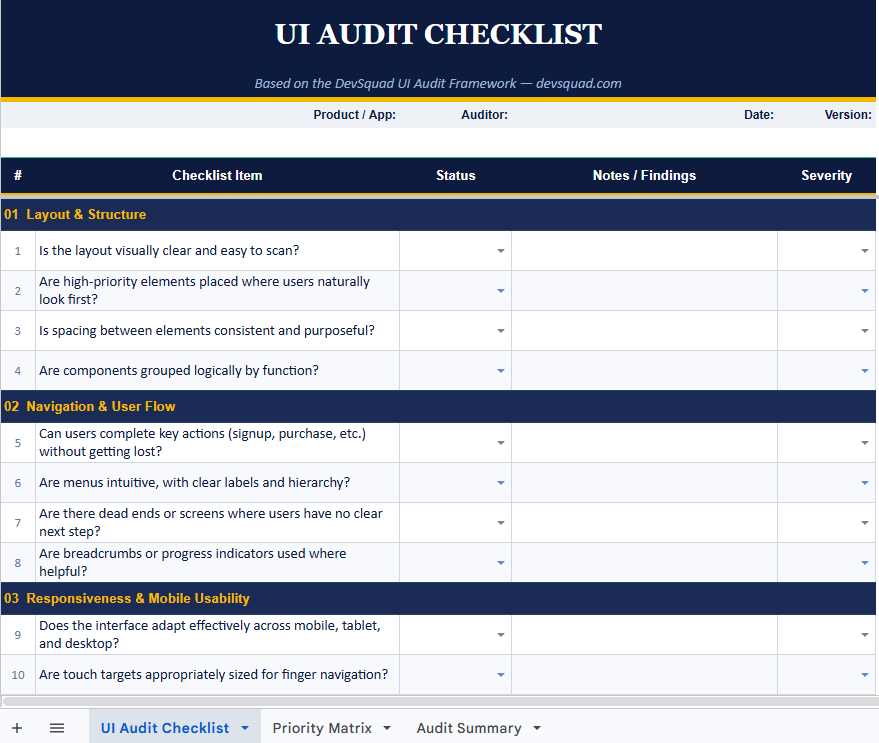
UI audit checklist
When conducting a UI audit, it’s critical to evaluate a wide range of design elements to ensure a seamless and effective user experience. Use this checklist to uncover usability issues and opportunities for improvement.
Layout and structure
☐ Is the layout visually clear and easy to scan?
☐ Are high-priority elements placed where users naturally look first?
☐ Is the spacing between elements consistent and purposeful?
☐ Are components grouped logically by function?
Navigation and user flow
☐ Can users complete key actions (signup, purchase, etc.) without getting lost?
☐ Are menus intuitive, with clear labels and hierarchy?
☐ Are there dead ends or points where users have no clear next step?
☐ Are breadcrumbs or progress indicators used where helpful?
Responsiveness and mobile usability
☐ Does the interface adapt effectively across mobile, tablet, and desktop?
☐ Are touch targets appropriately sized for finger navigation?
☐ Are important functions preserved or optimized on smaller screens?
☐ Is horizontal scrolling avoided except where intentionally designed?
Color and visual contrast
☐ Do colors follow a consistent system (e.g., brand palette, semantic meaning)?
☐ Is there sufficient contrast between text and background for readability?
☐ Are colors used intentionally to draw attention or indicate action?
☐ Can users rely on more than just color to understand meaning (for accessibility)?
Typography and readability
☐ Are fonts legible at all screen sizes and resolutions?
☐ Is there a clear visual hierarchy across headings, body text, and labels?
☐ Are line lengths and spacing optimized for reading ease?
☐ Are font styles and weights consistent across the product?
UI components and visual consistency
☐ Are buttons, forms, and icons used consistently across all pages?
☐ Are interactive elements easily distinguishable from static content?
☐ Are icon meanings intuitive and supported by labels where necessary?
☐ Are microinteractions and animations purposeful, not distracting?
Interaction feedback and system states
☐ Do buttons, forms, and inputs provide real-time feedback (e.g., success, loading)?
☐ Are error states informative and easy to recover from?
☐ Is user progress communicated during multi-step tasks?
☐ Are confirmation or warning messages used appropriately before critical actions?
Performance and perceived speed
☐ Does the UI load quickly and respond without lag?
☐ Are transitions and animations optimized for performance?
☐ Are skeleton screens or loading indicators used to reduce perceived wait times?
Accessibility and inclusive design
☐ Can users navigate using a keyboard and screen reader?
☐ Are alt texts provided for all important images?
☐ Is content structured using semantic HTML (for web)?
☐ Are all users able to complete key actions without assistance?
Testing and validation
☐ Have you reviewed session recordings or heatmaps (e.g., Hotjar, FullStory)?
☐ Have you conducted usability testing with real or representative users?
☐ Have you analyzed support tickets or feedback for recurring UI complaints?
☐ Has your design been QA-tested on real devices and browsers?
UI audit template
Here is DevSquad’s UI audit template you can download.
This template helps you conduct a structured UI audit using the same framework outlined in this guide.
The spreadsheet includes three tabs that help you evaluate your product's user interface, identify usability issues, and prioritize improvements based on business impact. Whether you're preparing for a redesign, modernizing a legacy application, or improving an existing product, this template provides a practical framework for turning audit findings into an actionable roadmap.
Step 1: Document your audit details
Open the UI Audit Checklist tab and complete the audit information at the top of the sheet.
Fill in:
Product / Application — The product you're evaluating
Auditor — The person conducting the audit
Date — The date of the review
Version / Sprint — The current release, version, or sprint number
This information helps you track findings over time and compare audits as the product evolves.
Step 2: Complete the UI audit checklist
The checklist is organized into 10 categories that cover the most important aspects of a user interface audit.
For each item:
Review the product against the audit question.
Select a status from the dropdown:
✓ Pass — No issue identified
✗ Fail — Improvement needed
→ In Progress — A fix is already underway
— N/A — Not applicable
If the item is marked as Fail or In Progress, select a severity level:
Low — Minor issue with limited impact
Medium — Noticeable friction for users
High — Significant usability or adoption concern
Document observations, examples, or supporting evidence in the Notes / Findings column.
As you work through the checklist, focus first on the user flows that drive adoption, retention, and conversions. Not every screen has equal business impact.
Step 3: Prioritize findings
Once the audit is complete, move to the Priority Matrix tab.
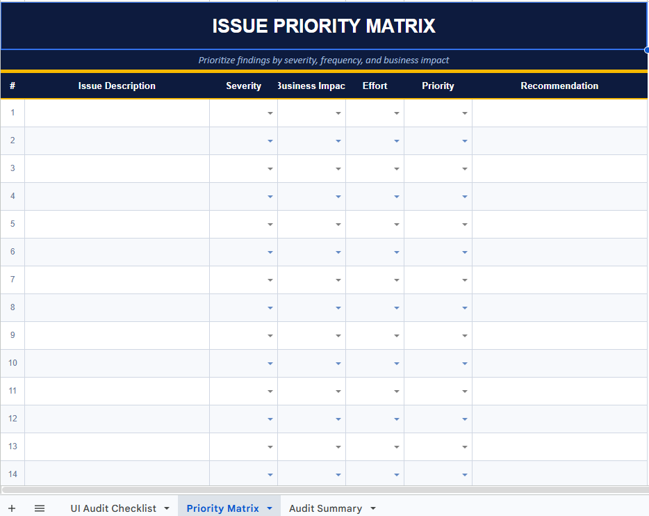
This worksheet helps you determine which issues should be addressed first.
For each significant finding:
Describe the issue.
Assign a Severity rating.
Assign a Business Impact rating.
Estimate the implementation Effort.
Select an overall Priority level.
Add a recommended next step.
The Priority Matrix helps teams focus on the improvements that will create the greatest impact for users and the business.
Step 4: Review the audit summary
The Audit Summary tab automatically compiles your results and provides a high-level view of the audit.
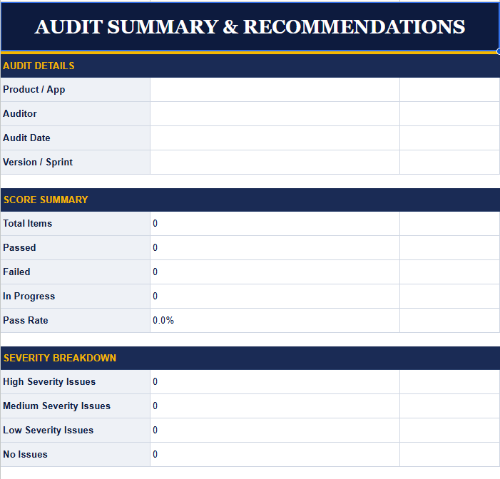
You'll see:
Total items reviewed
Pass rate
Severity breakdown
Issue distribution by category
Use the recommendations section to summarize your key findings and next steps.
This summary can serve as the foundation for your redesign roadmap or upcoming development sprint.
Step 5: Share findings with stakeholders
After completing the audit, share the results with product, design, and development stakeholders.
To use the template in Google Sheets, upload the spreadsheet directly to Google Drive. All formatting and dropdown menus will remain intact.
To create a report for stakeholders, export the spreadsheet as a PDF and include the checklist, priority matrix, and summary tabs.
Common UI audit mistakes
Even experienced teams can make mistakes during a UI audit. The most common issue is focusing on visual design alone while overlooking the business goals and user behaviors that ultimately determine whether a product succeeds.
Here are some of the most common UI audit mistakes:
Auditing aesthetics without evaluating usability
A product can look modern and polished while still being difficult to use. A UI audit should evaluate both visual design and how effectively users complete important tasks.
Ignoring user behavior data
Analytics, heatmaps, session recordings, support tickets, and user feedback often reveal problems that aren't obvious during a visual review. Always validate UI findings with real user behavior whenever possible.
Redesigning everything at once
Not every issue requires a complete redesign. Large-scale redesigns can introduce new usability problems and delay improvements. Focus on the highest-impact issues first and make iterative improvements over time.
Prioritizing trends over usability
Design trends change constantly. Following trends at the expense of clarity and consistency can make interfaces harder to use. The best user interfaces prioritize familiarity, predictability, and ease of use.
Failing to validate changes with users
Teams often assume they know what users want. User testing helps confirm whether proposed changes actually improve the experience before significant development resources are invested.
Treating accessibility as an afterthought
Accessibility should be evaluated as part of every UI audit, not as a separate exercise. Improving accessibility often improves usability for all users.
Conducting audits without clear business goals
I've seen teams spend weeks documenting interface inconsistencies that had little impact on product adoption or customer satisfaction. A successful UI audit starts with understanding which user flows and business outcomes matter most.
The 6 principles of the UI audit
UI audit is the process of breaking down each user interaction into a design frame, analyzing the design elements for consistency, and weaving it all together to give the end user a seamless product interaction experience.
UI audit is based on 6 key principles.
1. Predictable design paves the path to early product adoption
A product with a predictable design is better than a product with a creative design. Let’s look at an example.
A pharmacist’s sign is the same all over the world. Whether it’s India, Belgium, or the United States, they all go with the plus sign. This makes it easier to find and reach a pharmacy. Similarly, a user interface should be easy to use. Users should be able to achieve their tasks easily while using your digital product.
 An example of a predictable UI is a predictable design. Just like the pharmacist’s sign.
2. Minimize your user’s cognitive effort with empathetic design
People are in a hurry. They don’t have the time to explore and learn to use a complicated product. Therefore, the onus is on the UI designers to keep the design intuitive and instinctive.
For instance, consider Microsoft Edge. Microsoft Edge used to be called Internet Explorer. It’s one of the oldest browsers out there. But it isn’t as popular as Google Chrome because of its UI. The proof is here. It took me three attempts to figure out how to use the search engine on Microsoft Edge.
When I launch the browser, it should ideally allow me to browse – first.
However, I see the below screen that “enables a mysterious IE mode”, and “add a toolbar”, etc, etc. which has nothing to do with allowing me to browse. And the fact is, as a user I don’t want to do all this right now.
When a user wants to browse something on the internet, they’re usually in a hurry and just want to get the job done. It’s the product designer’s responsibility to keep the state of the end user in mind while designing the product. This is called empathy in design.
.webp)
An example of a complicated UI that delays the usability of the product
3. Product usability is directly proportional to its ease of use
94% of first impressions of a brand's website are related to its design.
The reason why many of us still haven’t made a switch to Microsoft Edge despite powerful AI integrations is because of complex UI and delayed usability as discussed in the above example. My first impression of Edge is - “Too complex. I want something simpler”. The moment the user realizes that the product is complex to use, product adoption takes a hit and they abandon the product.
4. Give your users the right balance of freedom and power
Too many options overwhelm and distract the users from their prime purpose. Just like the browser example, we saw above. At the same time, too little power in the user’s hands can make them feel constrained. Striking the right balance in the key to effective UI design.
5. Any element that doesn’t serve a purpose should be eliminated
Apple is probably the biggest advocate of this principle. They keep their UI minimalistic and focus on optimizing their operations and functions. They eliminate all unwanted UI and keep the design clean which makes their product experience highly enjoyable.
 An example showing Apple’s minimalistic design and powerful messaging that lets the users do what they intend to
6. Use common-world representations to increase the relatability of your product
Familiarity instantly puts the user at ease. On the other hand, using foreign-looking UI elements/design discourages the users from using the product. It’s a natural human tendency.
 An example of a UI icon that looks like a calendar to represent a calendar
Benefits of conducting a UI audit
One of the main benefits of conducting a UI design audit is improved usability. By taking a closer look at your site's interface and making the necessary changes, you can make it easier for users to navigate your site and find what they're looking for. This can lead to increased satisfaction and loyalty from your users.
The stakes are high. One poor interaction can cost you a user for good. A striking 88% of consumers say they won’t return to a site after a bad experience, underscoring the cost of neglecting UI issues.
 NPS pop-up from Storychief
Another benefit of conducting a UI audit during the early stages is that it can help you identify potential problems with your product’s design. And it’s best to fix these problems before they ripen into bigger roadblocks and cause further damage. For example, if you notice that users are having difficulty finding certain pages on your site, you can make changes to improve the navigation before they abandon the site.
Conducting a UI audit helps understand your users and their needs. By observing how they interact with your site, you can gain valuable insights into what works well and what doesn't. This information is crucial in improving future designs.
Looking for a team of product design experts to improve your UI? DevSquad has assembled an experienced product design team that’s built products for brands like ADP, Box, Swell etc. DevSquad is where product strategy meets execution. Get in touch now.
What is a UX audit
A UX audit is conducted to build a user-focused product.
If a digital product isn’t producing the results it used to or you expect to, it’s time to evaluate your user-product dynamics. A UX audit is the process of detecting user pain points and unexpected user behavior that has a direct effect on conversions or product adoption.
What’s more, investing in UX design has the potential to increase conversions by 83% and deliver a massive ROI of 9,900%. So conducting UX audits is something to take very seriously.
The main objectives of a UX audit
Identify gaps in user experience
Improve product performance
Make your product easy to use and navigate
Make it easy to find the right information
Understand how your users behave while using the product
5 steps of a UX audit
Conducting a UX audit is a rigorous 6-step process that evaluates the usability, accessibility, and efficacy of a digital product from the perspective of the end-users.
1. Define your product rediscovery goals
The tech world is changing at a rapid speed, especially in the age of AI. The way people use technology is transforming. With that in mind, it’s important to position your product in the marketplace competitively. And it starts with defining your business objectives for the product.
Start off with talking to internal product stakeholders such as product owners and developers, and ask them for information on product requirements, development plan, and outcomes.
The first step to UX auditing is conducting a ‘product rediscovery’ where stakeholders sit down to understand the initial goals for the product. Product rediscovery is all about helping users to remember their initial goals and improving UX to meet those goals, from unifying redundant flows to redesigning interim elements.
- Andrei Iordache, Founder & UI/UX Director, Updivision
2. Conduct a competitor analysis
A UX competitor analysis is a process to assess your product positioning in the market. The process gives you an overview of a product’s:
Features
Functions
Flows
Flaws
Feelings and frustrations the user experiences
UX competitor analysis helps you identify the gaps in your product design and usability. It helps assess the advantages and disadvantages of your digital UI and resolve the usability challenges.
Here’s an example of a competition analysis comparison chart.
 An example of a competition analysis comparison chart with UX observations
3. Investigate and define user goals with heuristic analysis
User behavior keeps changing over time. Heuristic evaluation is a process where experts test the usability of a product’s UI and report their findings, flaws, solutions, and recommendations to improve the user experience.
Some heuristic analysis and UX auditing tools like Heurix and Hotjar help evaluate websites to uncover usability challenges. Alternatively, UXCheck is a chrome extension that helps identify UX issues on a website.
Here’s an example of putting together a heuristic analysis report.
 Heuristic analysis report byTalia Wolf
“We use a competitive assessment report where the important data of the product’s major competitors is compiled and presented. This includes reports on the current performance issues, areas for improvement, and the designer’s recommendations. We conduct user behavior analysis through the use of heatmaps. This allows us to identify how the users click, scroll, and move on the website.”
- Leizel Laron, UI/UX Designer at Exaweb
4. Compile a UX report with an analysis
A UX analysis report is a product and user discovery summary of the approach used, research, data, and insights analyzed.
“A UX report is useful when it contains information on specific usability issues and provides actionable recommendations for improvement, such as simplifying forms or
improving visual hierarchy.”
- Mohit Maheshwari, Co-Founder of NMG Technologies
5. State your recommendations and next steps
Andrei Iordache, the founder of Updivision says that it’s important to break down complex tasks into step-by-step wizards to give the user a sense of progress. And that’s exactly what your recommendations should capture to implement.
Applications, especially minimum viable product models, often struggle with onboarding users. Therefore, making support elements easily accessible and cleaning up the navigation are some of the most common UX recommendations.
UX audit checklist
Use this checklist to uncover UX gaps that affect product usability, engagement, and conversions. Each item is rooted in real-world friction points and tied to how users behave and feel inside your product.
Task completion and usability
☐ Can users complete their core tasks without confusion or unnecessary steps?
☐ Is onboarding short, clear, and outcome-focused?
☐ Are workflows logical, with clear start and end points?
☐ Do users know what action to take next on every screen?
☐ Are support or help options available at the point of friction?
Behavior and conversion analysis
☐ Where are users dropping off in key flows (signup, checkout, onboarding)?
☐ Are users hesitating, clicking the wrong elements, or looping behaviors?
☐ Are users reaching your intended success metrics (e.g., form submission, feature activation)?
☐ Is there a defined “aha moment,” and do users get there quickly?
Feedback and error handling
☐ Are error messages helpful, specific, and human?
☐ Can users recover easily from mistakes or abandoned tasks?
☐ Are confirmation messages and success states clearly communicated?
☐ Are loading states, delays, and system feedback handled gracefully?
Content and navigation
☐ Is the content written in user language, not internal jargon?
☐ Can users find what they need in under 3 clicks or taps?
☐ Are empty states helpful and instructive, not just blank?
☐ Do headings, labels, and buttons clearly reflect their function?
Sentiment and user satisfaction
☐ Do users describe the experience as simple, helpful, or delightful?
☐ Are users giving the same feedback repeatedly in support tickets or reviews?
☐ Are new users returning after their first session?
☐ Have recent usability tests surfaced frustration, confusion, or churn risks?
Accessibility and inclusivity
☐ Is keyboard navigation supported throughout key flows?
☐ Do screen readers interpret your app correctly?
☐ Are core actions possible for users with visual or motor impairments?
☐ Is color the only way information is communicated?
When is a UX audit performed?
UX UI design audits are conducted at several stages during the product development cycle and testing phases depending on the state of the business.
For example, if the marketing team has published a usability survey report after receiving feedback from the users, the next step is to conduct a UX audit to see if the product matches the feedback and identify the usability gaps.
What are the outcomes of a UX audit?
A UX audit can help improve the product experience for the user which results in:
Increased conversion rate
Decrease in customer acquisition costs
Reduced bounce rate
Increased customer satisfaction
Increase customer loyalty
Increased sales
Customer Retention
Better user engagement
Top 3 UX audit services
AndersenLab is a professional design services agency that offers a range of UI/UX solutions including UX audits, app design, and redesign services.
RubyGarage is a software development and consulting company in Europe that builds solutions for startups and established businesses.
DevSquad is a SaaS/Tech product development company that offers full-stack tech management services. Every development squad is supported by a product manager, DevOps engineer, QA tester, and UX designer.
Learn more about our dedicated UX/UI services.


Phil Alves is the CEO and Founder of DevSquad and DevStats. He’s built and launched 100+ software products for bootstrapped founders, fast-growing startups, and enterprises. Phil writes about SaaS, product strategy, operational complexity, and building scalable development processes. He enjoys aviation, investing, and learning from other SaaS founders.